
Welcome to the
Visuals Intensive for Data Storytelling Course
Hear from Brent Dykes how to turn your charts into data scenes your audience understands at a glance.
Course Overview
Your charts are accurate. Your analysis is sound. And yet your audience fails to grasp your key point or loses sight of what's most important. The charts did their job during your analysis. They just weren't built to communicate your takeaways.
This focused course takes the visuals section of my Effective Data Storytelling Masterclass and builds it out as a standalone program. You'll learn how to construct a data scene, the five elements that make one work, and the principles for choosing, refining, and focusing your visuals so the takeaway is obvious at a glance. Whether you're an analyst, a manager, or a business leader, you'll leave with a practical approach you can apply to the very next chart you build.


What You Will Learn
1. How human perception works and how to establish a visual hierarchy that directs attention where you want it.
2. How to use color strategically so it highlights what matters instead of competing with it.
3. The 5 elements of a data scene: canvas, headline, data or chart, graphical cues, and annotations, and how to write headlines that state the takeaway.
4. How to identify the right data and choose the right visualization for the message you need to communicate.
5. How to remove noise and clutter, focus attention, and make your data approachable without oversimplifying it.
6. How to instill trust in your numbers so your audience believes what they see.
7. How to use AI to enhance your data scenes, both to build stronger visuals and to inspect the ones you've already made.
Meet your instructor
Brent Dykes
Author of Effective Data Storytelling: How to Drive Change with Data, Narrative, and Visuals, Brent's passion for effective data communication comes from his unique background in both marketing and analytics consulting. For the past 10 years, Brent has delivered data storytelling training workshops to leading organizations around the world, including IKEA, Microsoft, Amazon, Pfizer, Fidelity, and many others.
The visual principles in this course have been refined over hundreds of workshops with thousands of participants, and they are a core component of Brent's flagship Masterclass.

"Today, most people know their chart types. Where they really struggle is turning the exploratory charts from their analysis into explanatory ones that make their points clear. This is the course that closes that gap, so your key takeaways influence decisions and drive action."
Brent Dykes
Course Preview and Timing
Once you sign up, you'll have immediate access to all 19 lessons below
(and two bonus lessons)!
- 01: Data Storytelling Fundamentals (11:03)
- 02: Understand How Human Perception Works (10:50)
- 03: Establish a Clear Visual Hierarchy (11:28)
- 04: Master the Strategic Use of Color (13:19)
- 05: Core Components of a Data Scene (7:29)
- 06: Create Strong Headlines (9:27)
- 07: Find the Right Visual Tool for the Job (4:27)
- 08: Identify the Right Data for Your Data Scenes (7:39)
- 09: Choose the Right Visualizations (17:40)
- 10: Calibrate Your Visuals to the Message (6:15)
- 11: Remove Unnecessary Noise and Clutter (16:14)
- 12: Focus Attention on What Matters - Part 1 (6:28)
- 13: Focus Attention on What Matters - Part 2 (12:24)
- 14: Make Your Data Approachable and Engaging - Part 1 (8:04)
- 15: Make Your Data Approachable and Engaging - Part 2 (13:02)
- 16: Instill Trust in Your Numbers (8:19)
- 17: Put Visual Design Principles in Practice (12:22)
- 18: Strengthen Your Data Scenes with AI (20:26)
- 19: Apply Your Visuals Techniques (4:04)
- Course Quiz
Your Learning Toolkit
What's included when you enroll
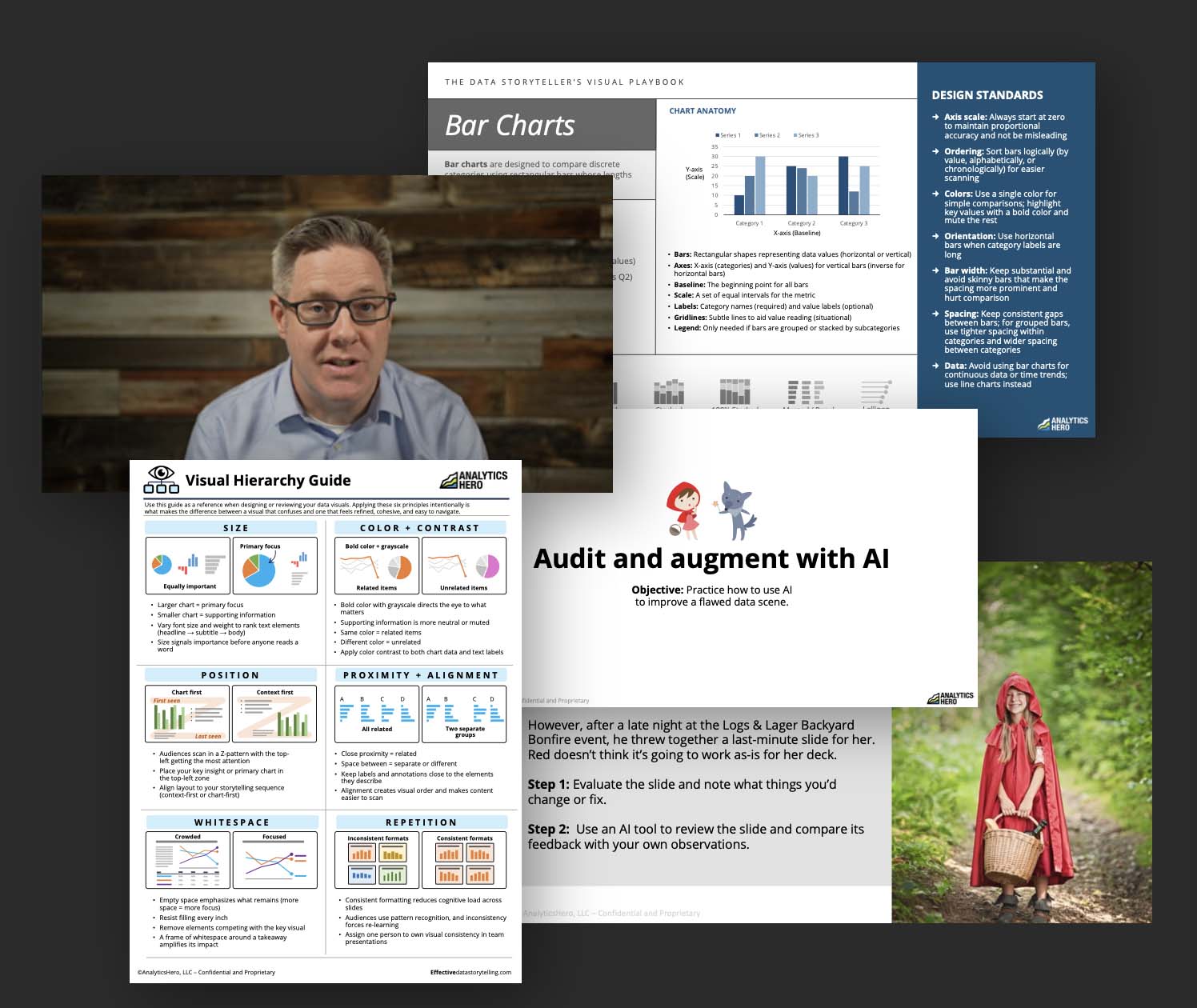
3.5+ hours of instructional videos with multiple hands-on activities to put your knowledge into practice.
Course features
- 21 instructional video lessons
- 5 hands-on activites with videos
- 4 downloadable reference sheets
- Data Scene Primer for use with your AI tool of choice
- Full Data Storyteller's Visual Playbook, featuring best practices for 10 common visuals (35 pages)
Key Benefits
- Full access for as long as the course is available
- Includes future expansions and updates
Certificate of Completion - Join the AnalyticsHero Data Storytelling Community

What Students Are Saying
"The videos were clear and practical, the exercises helped me apply concepts immediately, and the ready-to-use templates are something I can bring directly into my own presentations and Power BI projects."
Katharina C., Analytics Consultant
"It broke down complex ideas about data and narrative in an easy-to-follow way. It boosted my confidence to impact my coworkers' trust in my insights."
Bryce K., Financial Analyst

Group Pricing
Want your team to take the course? We're happy to arrange group discounts.


Licensing
We can work with you to customize and license the lesson content for internal training programs.
Testimonials
“Brent Dykes is the king of data storytelling; he’s probably thought about this more than anyone else on the planet.”
Thomas H. Davenport
Distinguished Professor, Babson College; Research Fellow, MIT Initiative on the Digital Economy
Frequently Asked Questions
How does this course relate to the Effective Data Storytelling Masterclass?
This intensive is the visuals section of the Masterclass, built out as a focused standalone course. It exists for people who want to strengthen one skill without taking on the full program. If you already have access to the Masterclass, you already have everything in this course, so there is nothing new to buy.
Can I upgrade to the Masterclass later?
Yes. Whatever you paid for this intensive is credited toward the Masterclass if you decide you want the full process. The credit is applied to the Masterclass price at the time you upgrade, so starting narrow never costs you anything.
How long will this course take to complete?
Most people will be able to complete all the content in a few weeks, depending on how much time you invest each week.
How long will I have access to this course?
There is no expiration date on your enrollment. You keep access for as long as the course is offered, and every update I make along the way is included at no extra cost. If I ever retire the course, enrolled students will receive advance notice to download the course materials.
Will I learn how to build charts in a specific tool?
This course teaches the principles for designing effective data scenes, and those principles apply in any tool. It does not include instruction on how to use specific analytics or charting software such as Tableau, Power BI, or Excel.
Are there tests or quizzes I need to submit?
The quiz is designed to help strengthen your learning. It is not graded or necessary to complete the course or get the certificate.
Can my employer pay for this course?
In most cases, we can make it work. Please contact us directly to discuss your options.
Do you offer a special discount to nonprofit organizations?
Yes! We offer a special discount rate for verified nonprofit organizations. Please contact us directly to learn more.